Dopamine Design: Why Your Website Deserves More Colour, More Play, and More Personality
- Quin @ hotmintdigital

- Dec 3, 2025
- 4 min read
If you’ve spent any time on the internet lately, you’ll know a lot of websites look… the same. Soft beige or black with a single pop of colour if we’re lucky. And, look... there’s nothing wrong with clean and simple. But sometimes clean and simple becomes clinical and snooze-inducing. At Hot Mint Digital, we’re on a small-but-cheerful mission to prove something important: Your can have a playful and colourful website design that's un-boring and still usable! You don’t have to choose between “professional” and “full of life.” And colour? Colour is not the enemy. Colour is the invitation.
Welcome to the world of dopamine design 🌈 where your brand gets to feel good, look good, and have a bit of personality.
So, what exactly is dopamine design?
Think of dopamine design as the intersection between good user experience and good vibes.
It’s an approach that encourages:
Colour used with purpose
Unexpected shapes and playful layouts
Illustrations and textures that catch your eye
Micro-animations that bring the pages to life
A dash of pattern where you’d least expect it
Personality that isn’t afraid to show up
It’s a design style that sparks a tiny sense of joy — the good kind that keeps people scrolling, clicking, reading and buying. And no, this isn’t about making everything “loud” or “chaotic.” It’s about making your small business website memorable in a sea of competition. Scroll and search fatigue is real for your customers, so a little hit of delight can go a long way.
Why colourful website design still matters (and why we’re not scared of it)
Colour psychology in web design isn’t new, but the way we use it can be.
At Hot Mint Digital, we use colour to:
Guide the eye, so visitors instinctively know where to go next
Set the tone, whether that’s calm, energetic, creative or quirky
Build brand recognition, especially for lifestyle businesses
Break the ‘template’ look that makes so many websites feel interchangeable
Your brand doesn’t need to blend in. It needs to feel like you. And for many small businesses — cafés, florists, crafters, venues, coaches — colour is one of the most powerful tools you have for standing out online.

Examples from our own projects (aka: proof that playful works)
We talk a lot about colour and personality, but here’s how it shows up in real life:
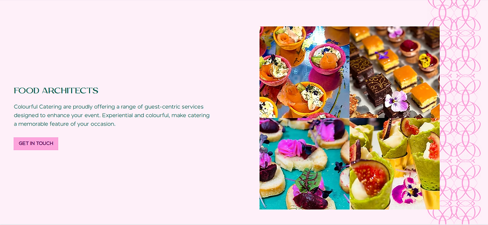
🍉 Bright gradients + punchy shapes
In projects like Colourful Catering, we leaned into vibrant tones and fruit-inspired palettes — because why shouldn’t the website feel as delicious as the food? Unexpected flourishes and pattern moments keep the energy high without distracting from the navigation.
🌸 Bold accents + organic textures
For floristry-inspired sites, soft curves, petal-like shapes and warm, blooming colour palettes help the brand feel approachable rather than overly polished.
💚 Hot Mint’s own playful chaos (strategic chaos, promise)
Our own site leans into dopamine design on purpose: bright stickers, cheeky animations and irregular shapes that still support a clear journey. Every pop of colour has a job to do.
🌟 Friendly illustrations + human photos
For creators, makers and lifestyle brands, illustrated touches and candid photography soften the digital experience — making your brand feel human, not “just another website template.”
These aren’t gimmicks. They’re strategic moments that create instant trust and recognition.

Patterns, textures and animations: the secret weapons
Everyone expects boxes, buttons and straight lines.
Nobody expects:
A scalloped border that hints at handmade craftsmanship
A playful hover animation that invites interaction
A background texture that feels tactile
Curved layouts that soften the page
These touches don’t just “look nice.” They keep visitors engaged, which leads to:
Higher dwell time
Better conversions
An experience people remember
Good dopamine design = good business.
But what about usability? Isn’t minimalism safer?
Minimalism was the safe choice for a long time. But now, sameness is the new risk.
You don’t need to sacrifice usability to have a website with colour and character. In fact, done well, dopamine design can improve UX because it:
Guides attention through contrast
Reduces decision fatigue
Makes CTAs more visible
Helps content feel lighter and more digestible
We’re big believers in accessible, strategic joy — design that looks fun while actually doing a lot of heavy lifting in the background.
So, should every small business jump into dopamine design?
Not necessarily. If your product is more minimalist then maybe this isn't right for you. Another common misconception is that 'colour isn't premium' but I bet if I said 'Tiffany's', you could picture their trademarked 'Tiffany Blue®' colour...
But if your brand is:
Creative or lifestyle-led
Community-focused
Warm, friendly or personality-driven
Tired of looking “just like everyone else”
Ready for a website that feels less 'corporate template' and more approachable
…then dopamine design might be exactly what you’ve been waiting for.
Ready to add a little joy to your online presence?
At Hot Mint Digital, we help time-poor small business owners build websites that feel bright, confident and completely true to who they are. No templates. No black and beige overload. No fear of colour. Just thoughtful, dopamine-fuelled design that works overtime, so you don’t have to.
Fancy chatting about a redesign or a fresh new website? Let’s make something unforgettable. 🌈


Comments